How to display your Google Sheets data in a marketing dashboard or report?
Octoboard marketing analytics platform allows you to easily integrate with Google Sheets documents and send data to live dashboards and reports.

GOOGLE SHEETS REPORTING
Google Sheets data in your business and marketing dashboards.
Alexa Integration: Building Automated Alexa Website Ranking Reports Using Octoboard
In the ever-evolving landscape of digital marketing, staying ahead of the curve is paramount for success. This is where the integration of Alexa data into the Octoboard analytics platform becomes a game changer for marketing teams. Alexa, an Amazon.com company, has been a key player in providing insightful web traffic data. Two of its pivotal metrics are 'Alexa Rank' and 'Alexa Reach', which can significantly aid marketing teams in showcasing their work effectively to clients.
Understanding Alexa Metrics
- Alexa Rank: This is a measure of a website's popularity compared to all other websites, based on a combination of average daily visitors and pageviews. A lower rank indicates a more popular website. This metric is crucial for gauging the overall visibility and popularity of a site on a global scale.

- Alexa Reach: It represents the number of users who visit a site. This metric is expressed as a percentage of all internet users. A higher reach indicates a wider audience, reflecting the effectiveness of marketing strategies in drawing traffic.
The Power of Automation in Reporting
Using Octoboard’s analytics platform, marketing teams can now automate the generation of website ranking reports powered by Alexa data. This automation saves hundreds of hours that would otherwise be spent on manual data collection and report generation. Regularly scheduled reports, whether monthly or weekly, provide consistent and updated visibility into the effectiveness of website ranking efforts.
Automating such reports ensures that teams and management are always informed about their website's performance without the need for constant manual checking. This consistent update streamlines the workflow and enables teams to focus more on strategy and less on data management.
Consolidating Website Ranking Channels
In today's digital landscape, tracking website performance across multiple channels is vital. The Octoboard platform excels by allowing the integration of various website ranking channels into one comprehensive report. This consolidation is essential for several reasons:
- It provides a holistic view of the website's performance.
- Enables quick comparison and analysis across different channels.
- Helps in identifying which channels are driving the most traffic and require more focus.

Enhancing PPC Analytics
Octoboard's advanced PPC Analytics module takes reporting a step further. Marketing agencies can benefit immensely from the ability to create new metrics, dimensions, and apply advanced formulas. This feature allows for a more tailored approach to analyzing PPC data across different channels, locations, and currencies. Such customization is crucial for marketing agencies that manage diverse campaigns and need to present data in a client-friendly manner.
Automating Trend Analysis with OpenAI
Octoboard's integration with OpenAI for automated data trend analysis is a significant advancement. By utilizing Alexa data, this feature can automatically detect and report on emerging trends. This capability is crucial for marketing agencies and teams to:
- Stay ahead of the curve by quickly adapting to new trends.
- Monitor marketing progress effectively and adjust strategies as needed.
- Ensure that all efforts are aligned with the latest market dynamics.
Utilizing Google Sheets for Enhanced Data Management
The Google Sheets data export feature in Octoboard is another tool that enhances the versatility of Alexa data usage. This feature allows marketing teams to export Alexa data directly to Google Sheets, where they can further manipulate and analyze the data. The benefits of this feature include:
- Easy sharing and collaboration on data with team members and clients.
- Enhanced data manipulation and visualization capabilities in Google Sheets.
- Streamlined workflow as data can be easily transferred and updated.

Why Choose Octoboard for Alexa Website Ranking Reports?
Choosing Octoboard for Alexa website ranking reports offers a multitude of benefits:
- It saves time and resources by automating the report generation process.
- Provides a comprehensive view of website performance across various channels.
- Enhances PPC analytics with advanced features for in-depth analysis.
- Offers trend analysis using cutting-edge AI technology.
- Facilitates easy data management and sharing with Google Sheets integration.
In summary, Octoboard’s integration with Alexa data transforms how marketing teams manage, analyze, and report website performance. It's not just about having data; it's about having the right tools to make that data work for you. By automating and enhancing the process of data analysis and reporting, Octoboard empowers marketing teams to make informed decisions, stay ahead of trends, and demonstrate their effectiveness to clients with ease and precision.
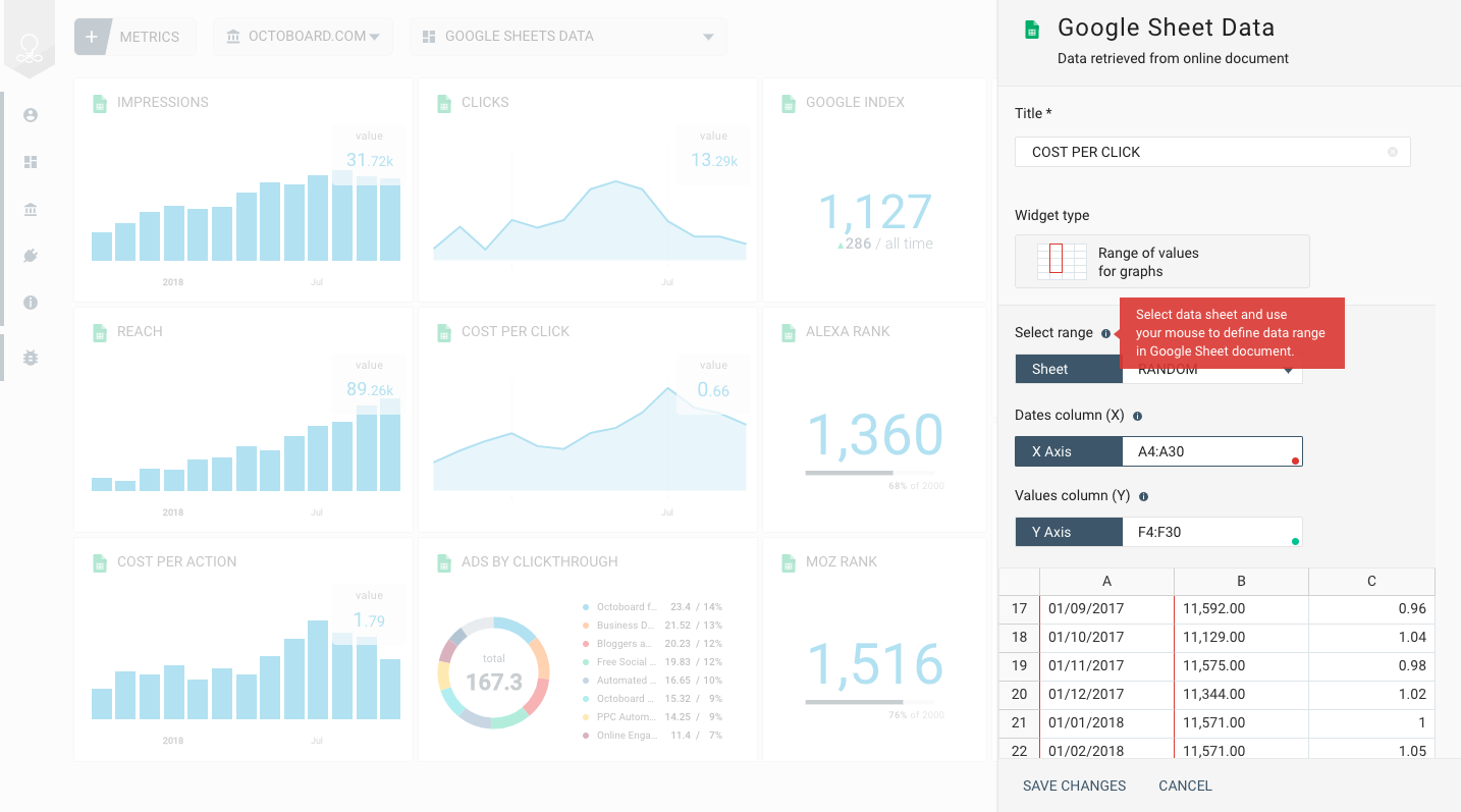
Google Sheets metrics
STEP 1 - CONNECTING TO GOOGLE SHEETS
- Press "ADD METRIC" button in the dashboard panel
- Select "CUSTOM DATA" tab in the wizard
- Select "GOOGLE SHEETS" panel as shown on the left
STEP 2 - SELECTING DOCUMENT
- Select existing account or press "ADD ACCOUNT"
- To add an account provide your Google account login details
- Once you connect to account - select a Google Sheets document from the list below
STEP 3 - SELECTING DATA FOR DISPLAY
- Select type of data to display - single value, historic data, category data
- Select data values the correspond to selected data type
SINGLE NUMERIC VALUE
- Number with delta - you can specify time frame for delta calculation
- Number or Gauge with target value - you can set target value in widget panel
- Line graph
- Bar graph
- Area graph
VALUE RANGE
- DATES COLUMN - holds calendar dates for display in X axis on graphs
- VALUES COLUMN - holds numeric values to display on Y axis in graphs
- Line graph
- Bar graph
- Area graph
- Number with delta - delta will be calculated by comparing last two values
- Number or Gauge with target value - you can set target value in widget panel
KEY-VALUE PAIRS
- Keys - data column that holds texts (or "categories", such as pages of your website, for example)
- Values - numeric values for each category (number of sessions for website pages)
- Pie chart
- Table
- Funnel