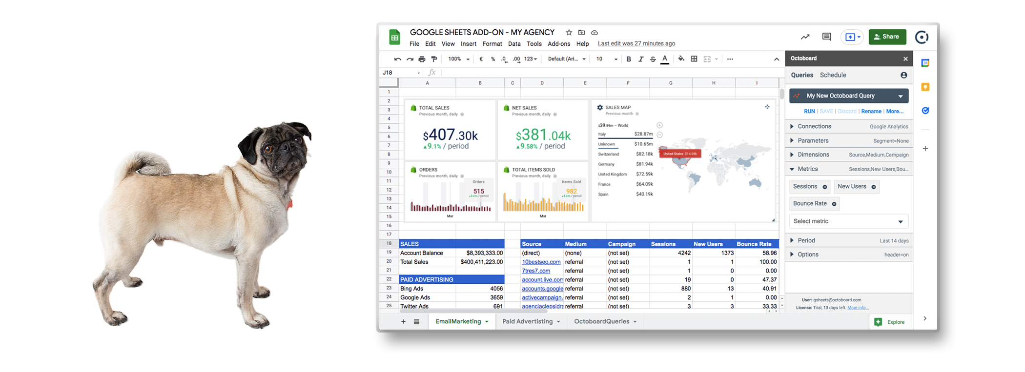
GOOGLE SHEETS DATA EXPORT ADD-ON
Choose your data sources, select the metrics and dimensions you want, and set up scheduled refreshes - all in your Google Sheets documents.
Send data directly
to Google Sheets
Install Octoboard plugin, connect to your marketing accounts, select the metrics and dimensions you want, and generate custom marketing reports - all in your Google Sheets documents.
Automated data refresh
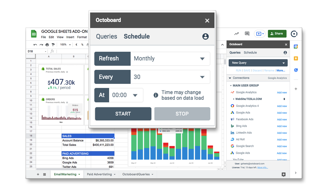
Build your custom reports. Configure automated hourly, daily, weekly and monthly scheduled data updates.
See the Big Picture —
Tell a Good Story
Gather all information across your multi-channel SEO, PPC, Sales and Marketing platforms.
Add executive summaries to reports or dashboards shared in client portals or hosted on your website. All 100% white label.
Account for Every Dollar – Across All Platforms
Know exactly how your ad spend converts to visits, leads and online purchases.
Effortlessly Showcase Results of Your Hard Work to clients and management.
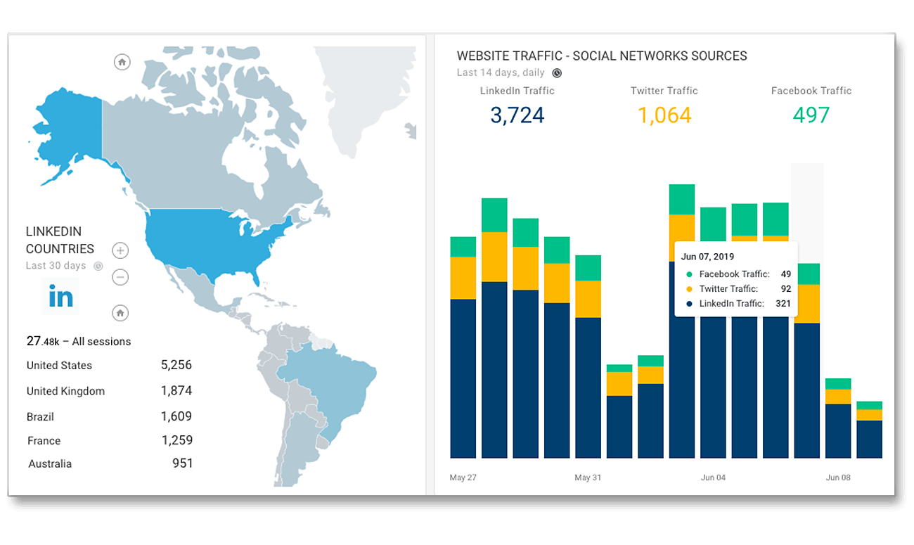
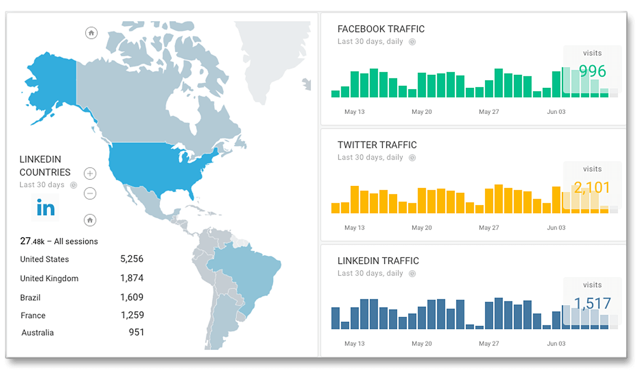
Multi-Channel Data in One Graph
Want to see the full picture of your ad spend across Google, Bing, Facebook and LinkedIn in one graph? This is what mashups are for.
Our data blending technology also works with Sales, Web Traffic, Leads or any data you can load from Google Sheets.
Use Mashup Widgets
For Complete Data View
Data blending is really easy with Octoboard. Simply select multiple cloud data sources and choose visualisation - stacked bar graph, table, pie chart or a map.
Our platform will start aggregating and updating your multi-channel data view automatically.